graphic designer | strategist | marketing specialist

Impact Partnership | Rebrand
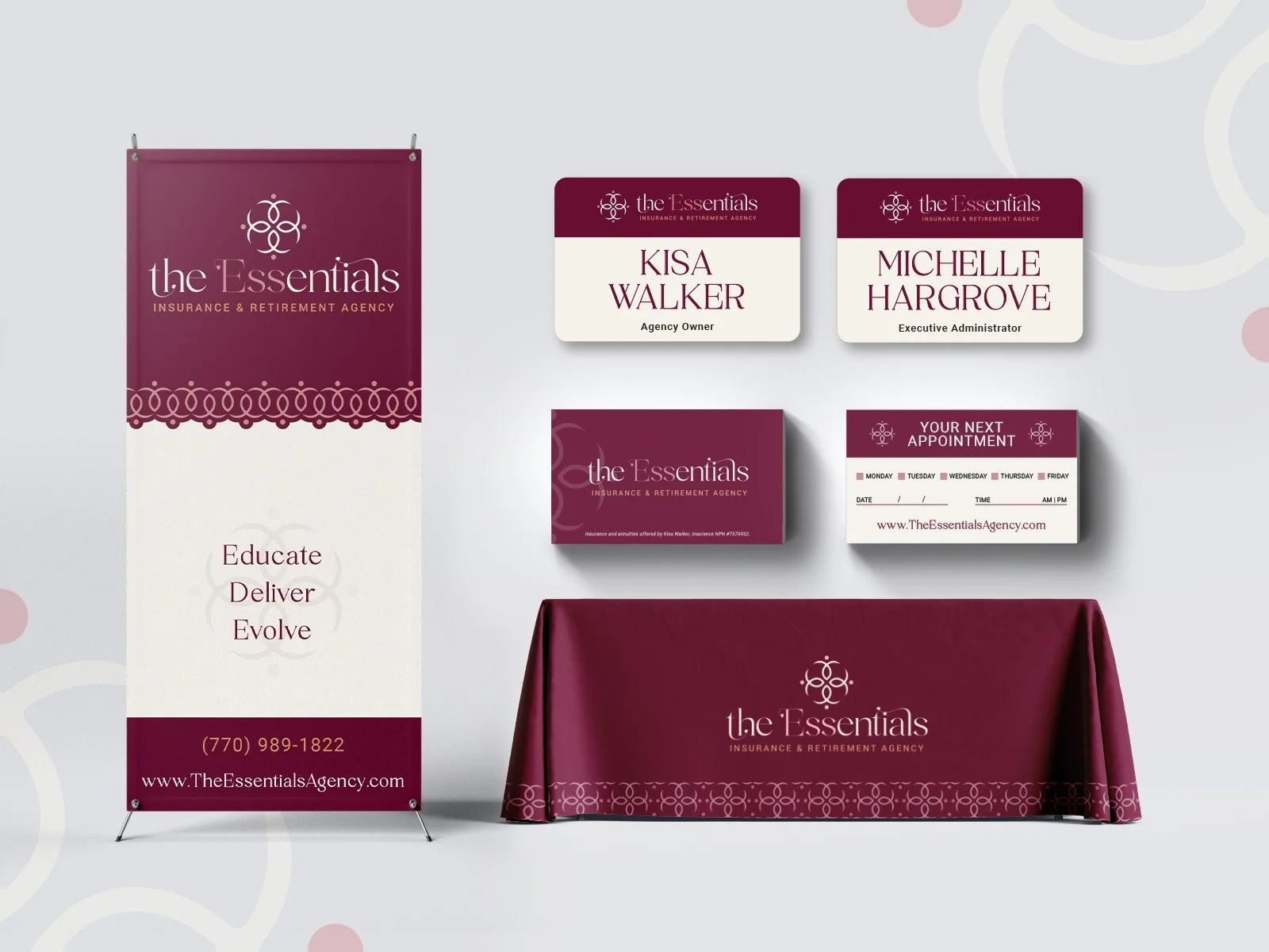
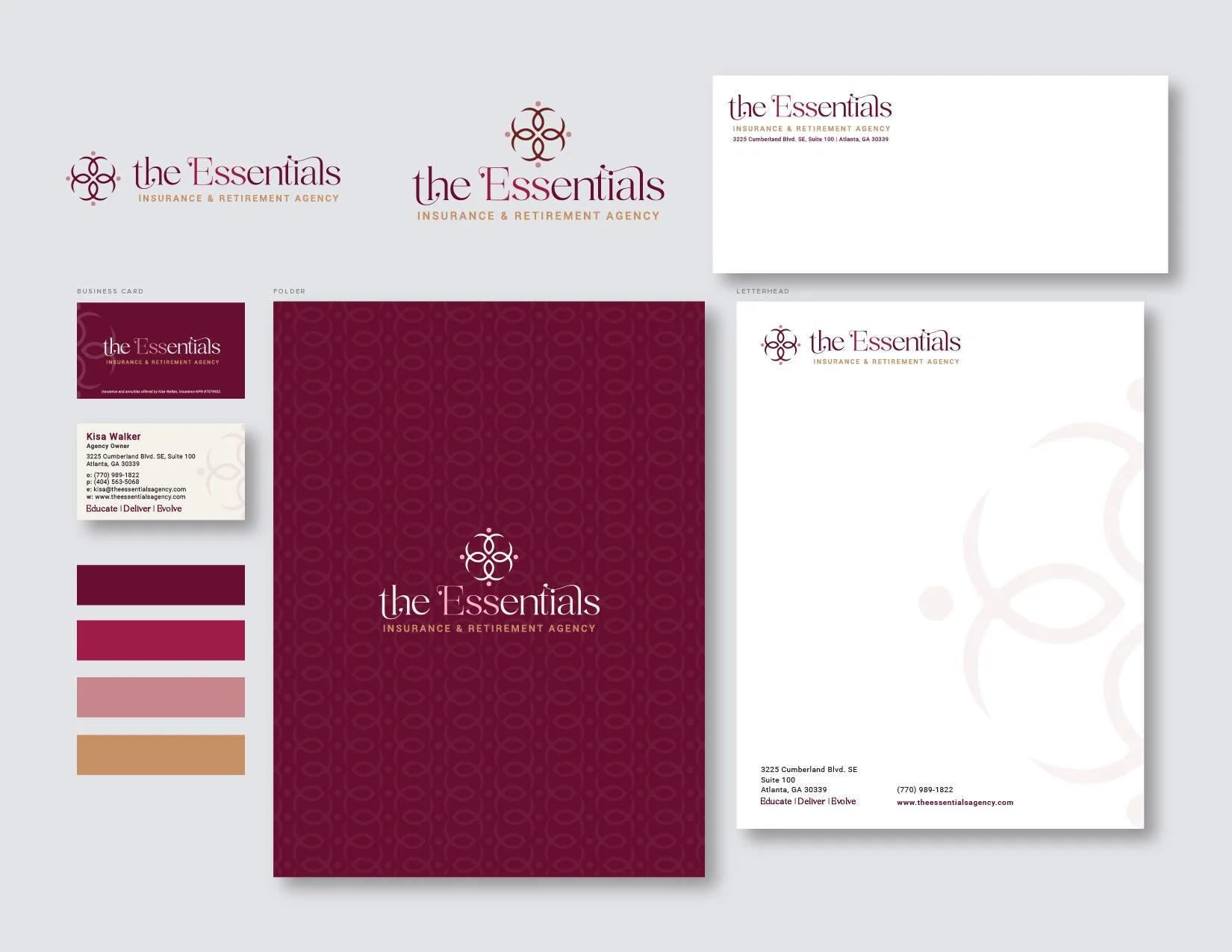
The Essentials represents the rebrand of Kisa Walker, an Atlanta-based insurance professional and agency owner. Kisa sought to refresh her company’s identity to stand out in a competitive market. As a smaller agency, she quickly qualified for a complete brand overhaul, including a new logo, business cards, corporate identity, and seminar kit materials.
Collaborating with the copywriting team, we delved into the heart of her company’s story. The rebrand involved renaming her business from K.M. Walker Insurance to The Essentials Insurance & Retirement Agency, a name deeply personal and symbolic. The name was inspired by the initials of her grandmother and mother (E.S.S.), honoring the legacy of the women who shaped her journey.
Kisa’s motivation for entering the insurance field stemmed from witnessing her grandmother face significant losses during a medical emergency. This experience ignited her passion for helping others navigate life and emergency planning with confidence and preparedness.
For the visual identity, Kisa envisioned a brand that was both feminine and strong. She requested a mauve color palette to convey elegance and sophistication, paired with an orchid icon—a symbol of beauty, resilience, and grace. The result was a distinct logo and logotype that encapsulated her mission and personal story, creating a brand that stands out while staying true to her values.
Impact Partnership | Rebrand
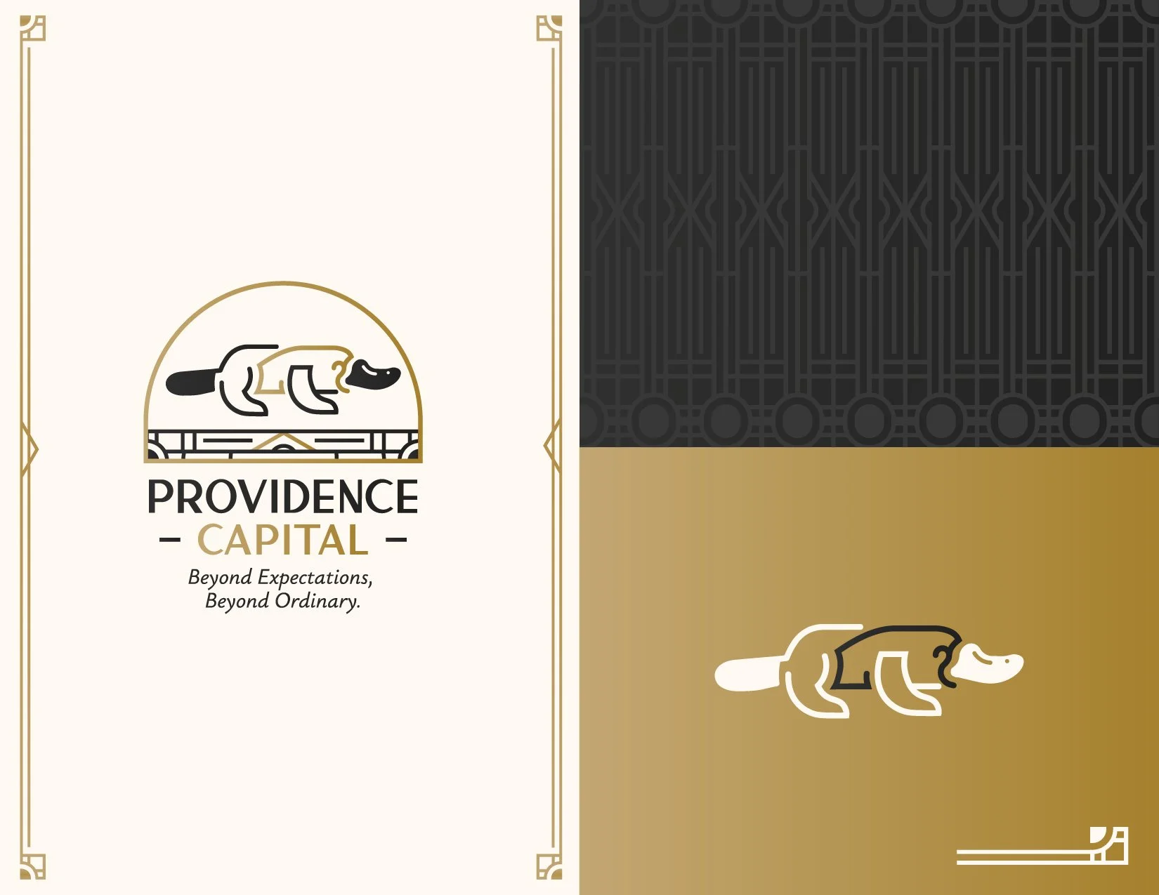
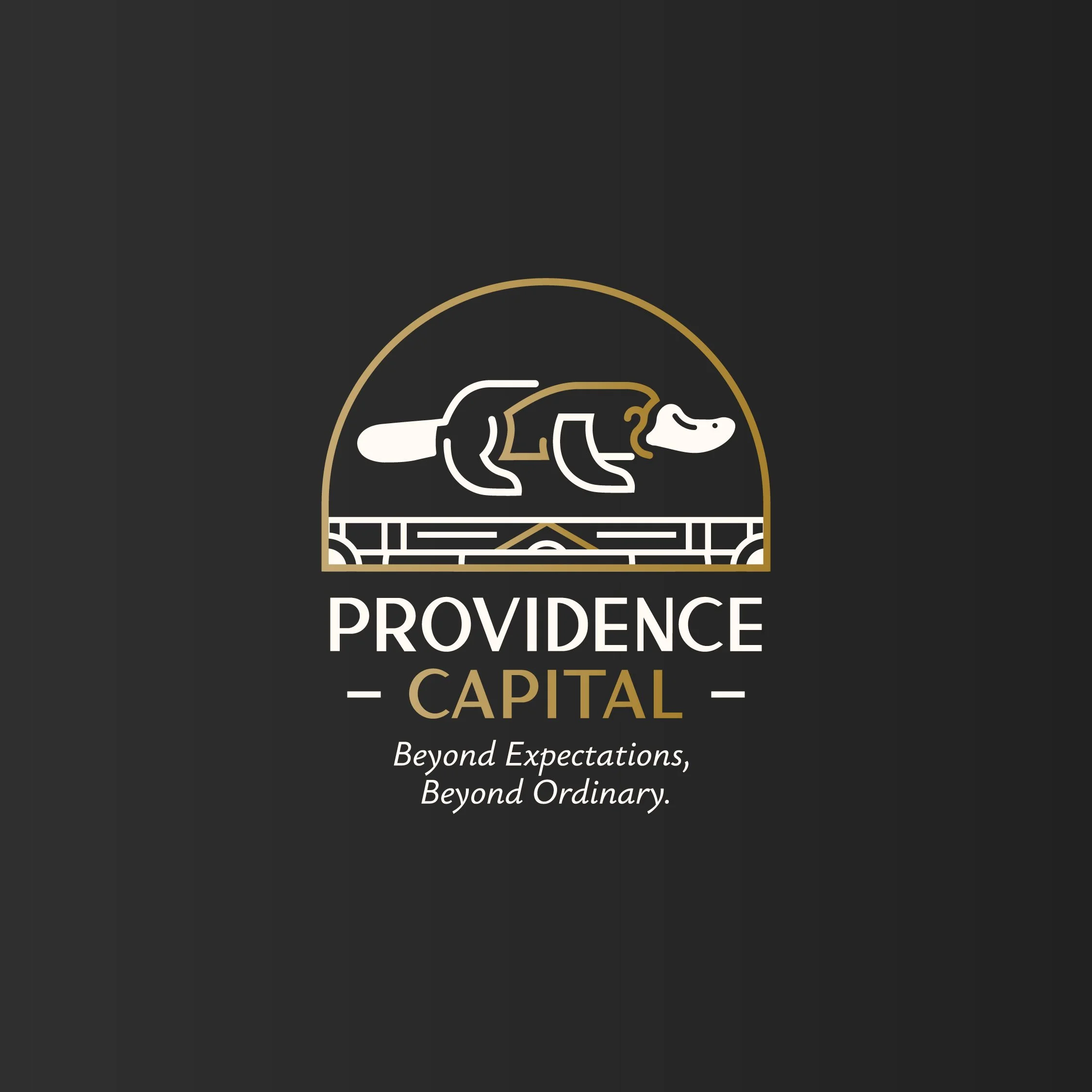
Mike Dyal, owner of Providence Capital, sought to refresh his brand with a design that captured his unique story and approach. Mike’s background is anything but conventional. He spent years working in industrial construction, where he honed his problem-solving skills and meticulous attention to detail. Later, he transitioned into insurance and life planning, bringing with him a commitment to helping others navigate complex financial landscapes.
During the branding process, Mike shared a fascinating idea: he was drawn to the platypus, an animal unlike any other, as a symbol of his one-of-a-kind philosophy and approach to life planning. He also expressed a deep appreciation for Art Deco design. These inspirations laid the foundation for a brand identity that is as distinctive as Mike himself.
To bring this vision to life, we crafted a black, gold, and crème color palette, exuding sophistication and timelessness. A sleek, Art Deco-style platypus was created as the centerpiece of the brand—unique, memorable, and reflective of Mike’s originality. Framing and arch elements inspired by Art Deco architecture were added to ground the design, while a bold, striking font completed the look. the tagline Beyond Expectations, Beyond Ordinary was integrated to prompt discussion about how the platypus tied into the brand’s core identity and values.
The result is a brand that mirrors Mike’s personal journey, professional expertise, and innovative approach to finance, taxes, and estate planning.
Multi-Channel Sales Marketing Campaign:
Lease Turn In Event
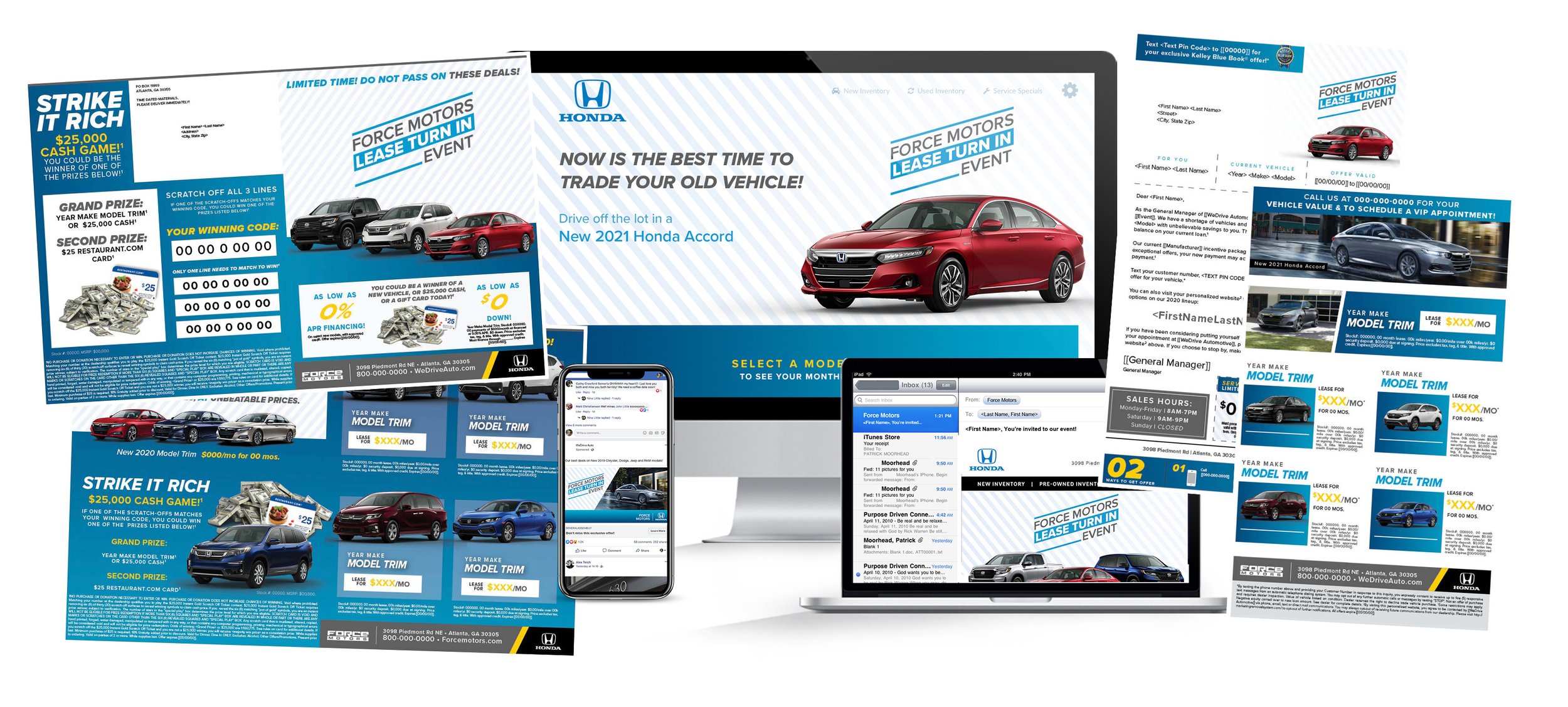
Introducing Force and its diverse portfolio of brands, revolutionizing automotive marketing by transforming not only the way messages are personalized for consumers, but also how consumers shop and ultimately make a purchase. We provide a holistic consumer lifecycle marketing solution for automotive clients, bridging the gap between dealerships and consumers, and fostering a new era of automotive marketing.
A key component of our strategy is the 'Lease Turn In Sales Marketing' event, a comprehensive multi-channel campaign that leverages both digital and print marketing to maximize reach and engagement with a conquest audience. This full-color campaign integrates a variety of innovative tools and channels to encourage targeted audiences to turn in their leased vehicles:
DMS Vehicle Information: Incorporates the Dealer Management System (DMS) to access vehicle information, enabling personalized communication and offers.
Unique Phone Number: Utilized for campaign tracking, this ensures accurate measurement of campaign effectiveness.
Personal URL Technology: Available for both digital and printed direct mail, this feature enables personalized communication and tracking of user engagement.
Mobile-Friendly Layouts: Ensures that buyback email campaigns are accessible and user-friendly across all devices.
Personalized Micro-Site: A custom micro-site that provides a personalized experience for each user, reinforcing the campaign message and encouraging action.
Facebook Advertising: Utilizing both standard and carousel formats to maximize visibility and engagement on one of the most popular social media platforms.
The design of the campaign utilizes clean lines and a striking blue color palette to create an inviting and impactful visual identity that resonates with the target audience. This cohesive and strategic approach to B2B and B2C graphic design and marketing ensures a seamless and impactful user journey from initial engagement through to the final transaction.
By integrating innovative technology, personalized messaging, and a multi-channel approach, Force is not only redefining automotive marketing but also driving results for our clients and creating a new kind of automotive buying experience for consumers.
Rebranding & Instagram Refresh:
Streamlining Brand & Content
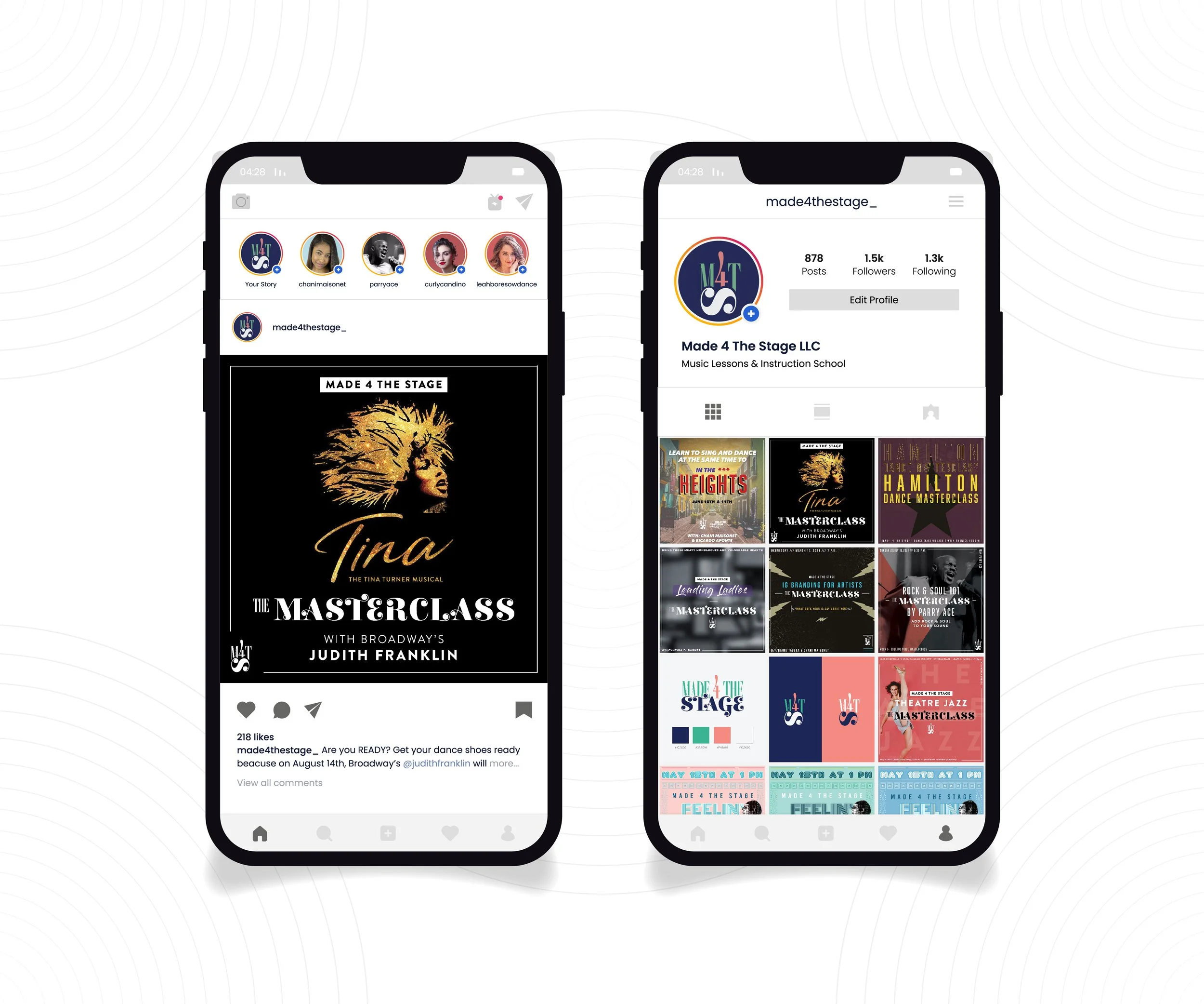
Made 4 The Stage (M4TS) is a dedicated performing arts training company, founded by performers for performers, with a mission to nurture both aspiring and professional artists in voice, dance, and acting. Central to our ethos is the belief that hard work, excellence, and professionalism are fundamental to success. We aim to be a 'gym' for performers, a space to flex creative muscles and fully develop one's potential.
Our dual mission extends to providing a stable income source and platform for arts teachers while offering affordable, top-quality training to artists. In addition to physical training, we recognized the need for a strong digital presence and communication strategy. As part of our rebranding, we overhauled our Instagram posts to ensure content is easy to consume and visually appealing. The focus was on text hierarchy and streamlining content to create a cohesive and representative brand identity.
Additionally, we offered a class on branding, leveraging para-social relationships, and the science of creating an authentic social media platform. This class aimed to empower artists to build genuine connections and support for their work as performance artists on Instagram.
The rebranding included repurposing previous motifs, colors, and similar fonts inspired by the bold letters of Broadway and the flamboyance of showbiz. This melded harmoniously with the classical and modern personalities of our founders, Chani Maisonet and Parry Ace, creating a refreshed brand identity that encapsulates M4TS's ethos and objectives and reinforces our commitment to nurturing artists and arts educators alike.
| Case Study |
Rebrand & Reposition:
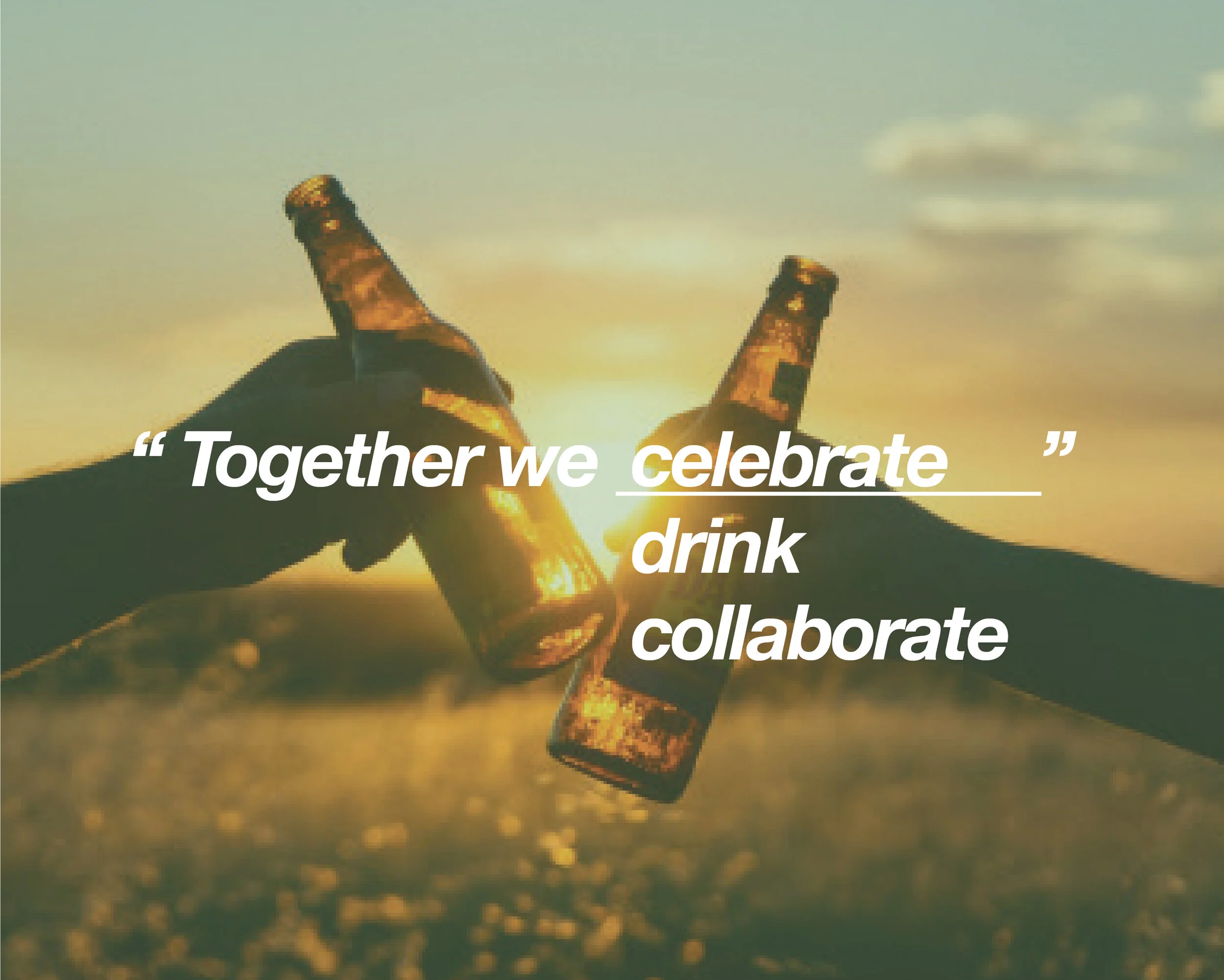
Together We
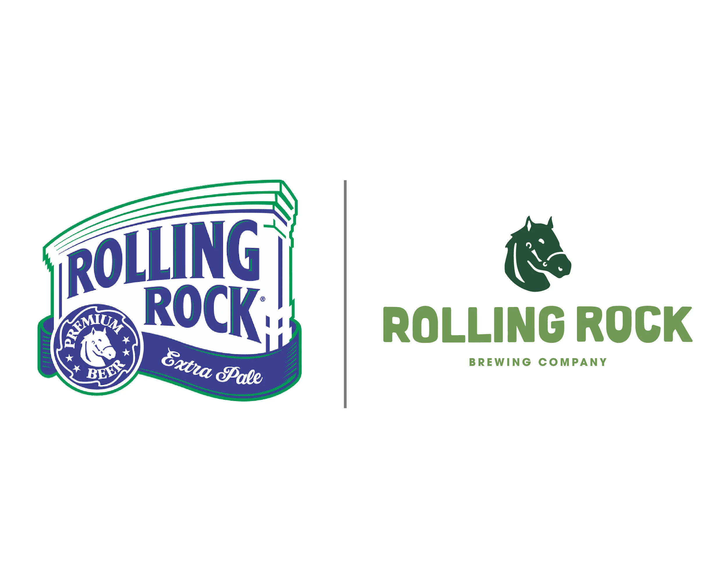
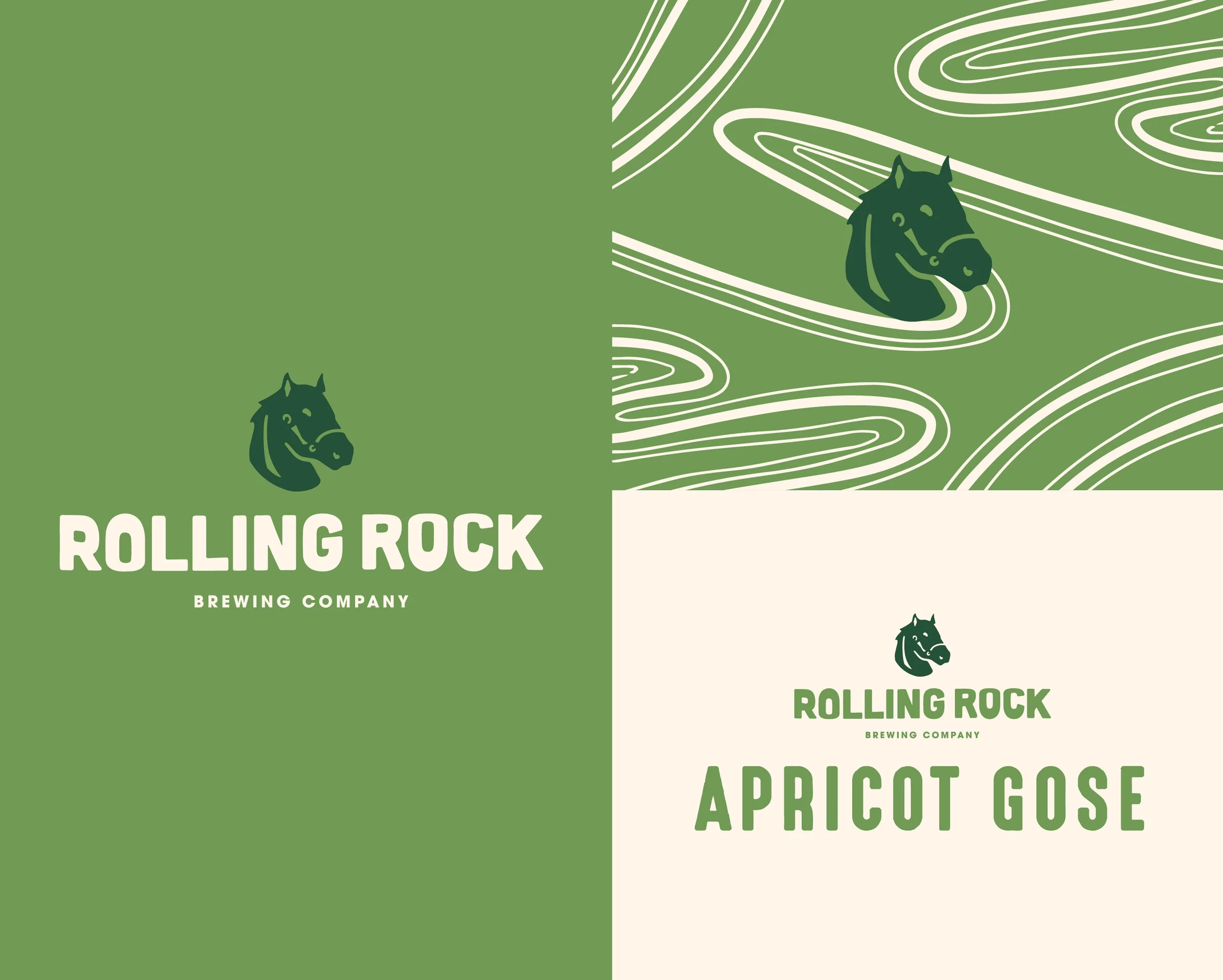
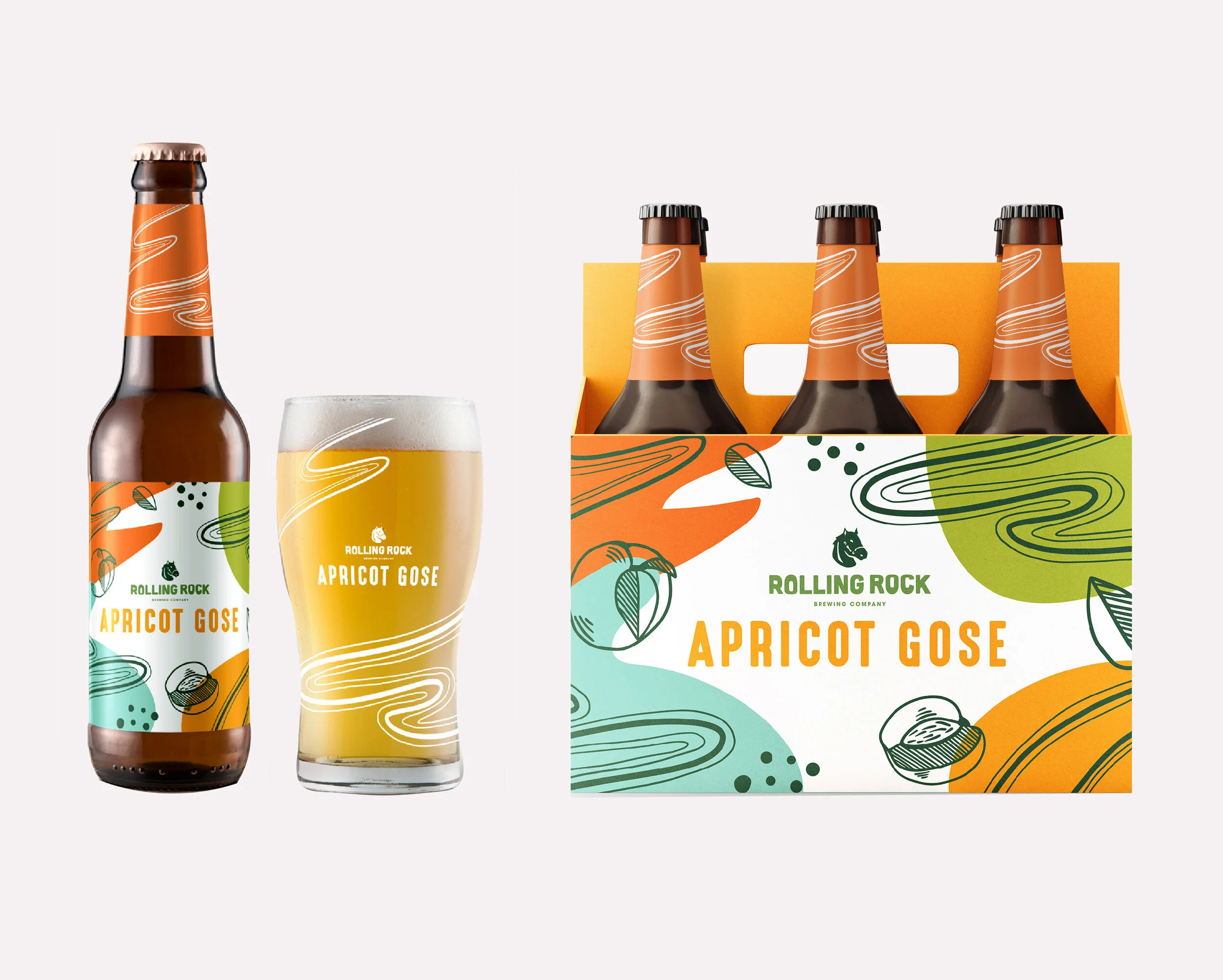
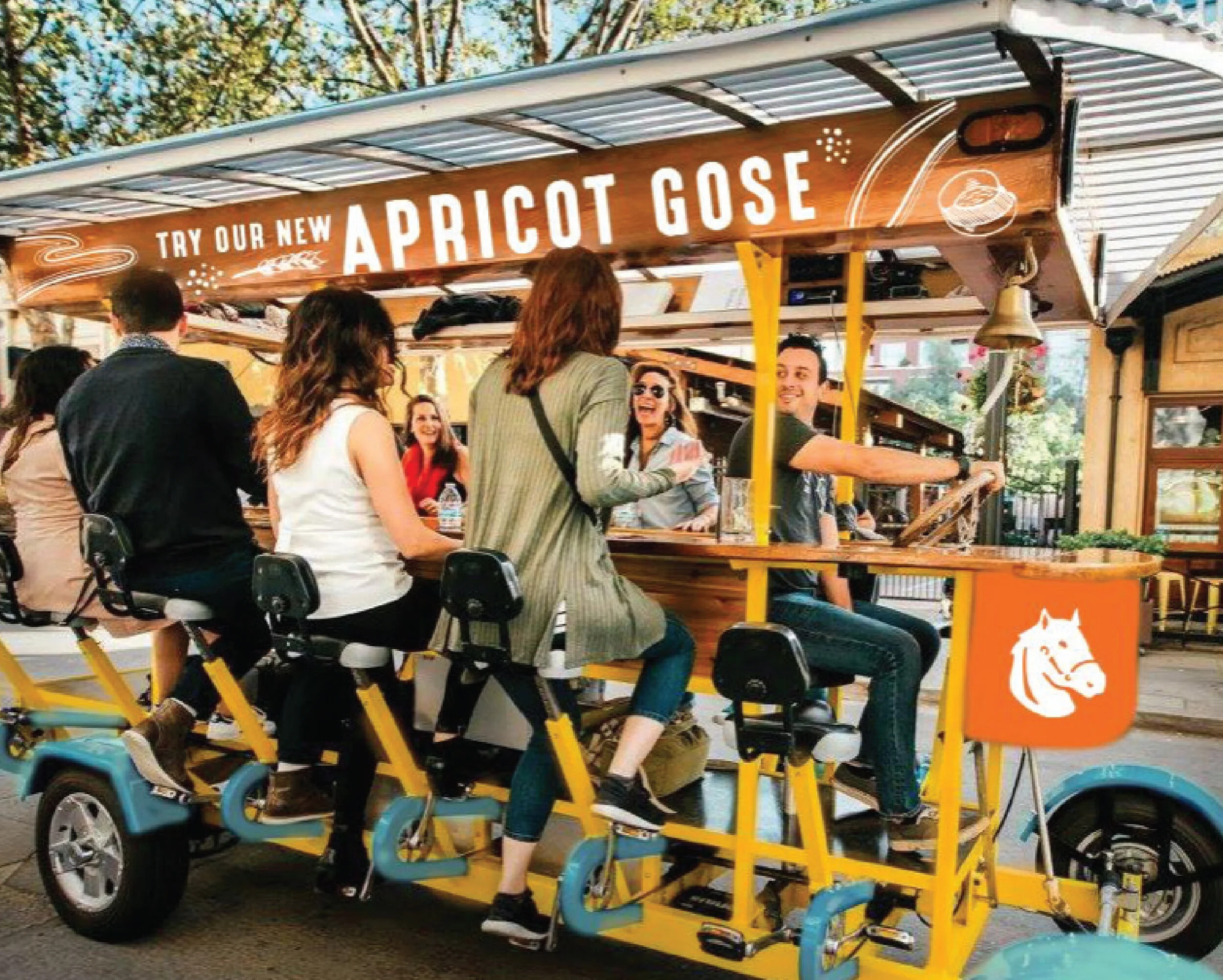
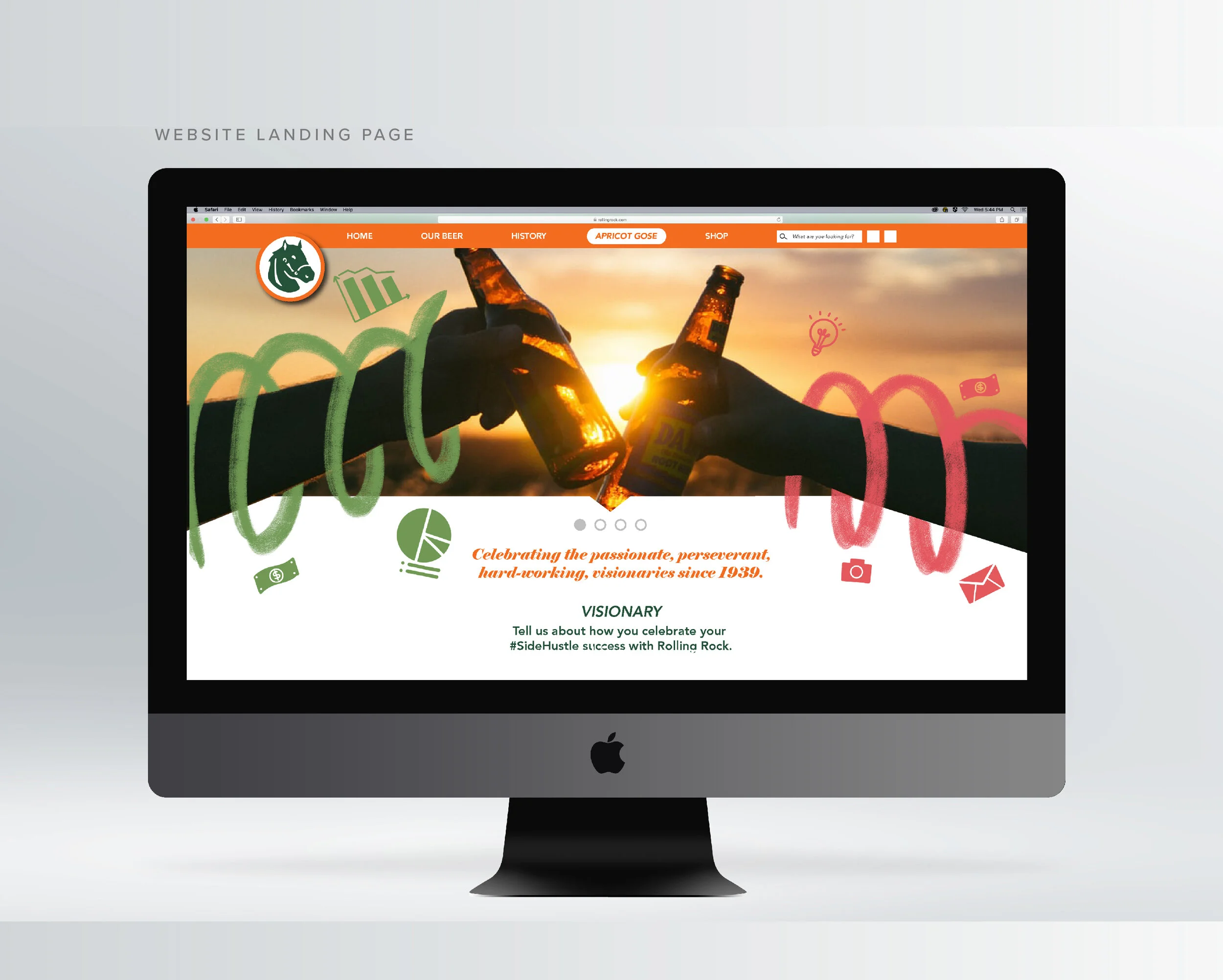
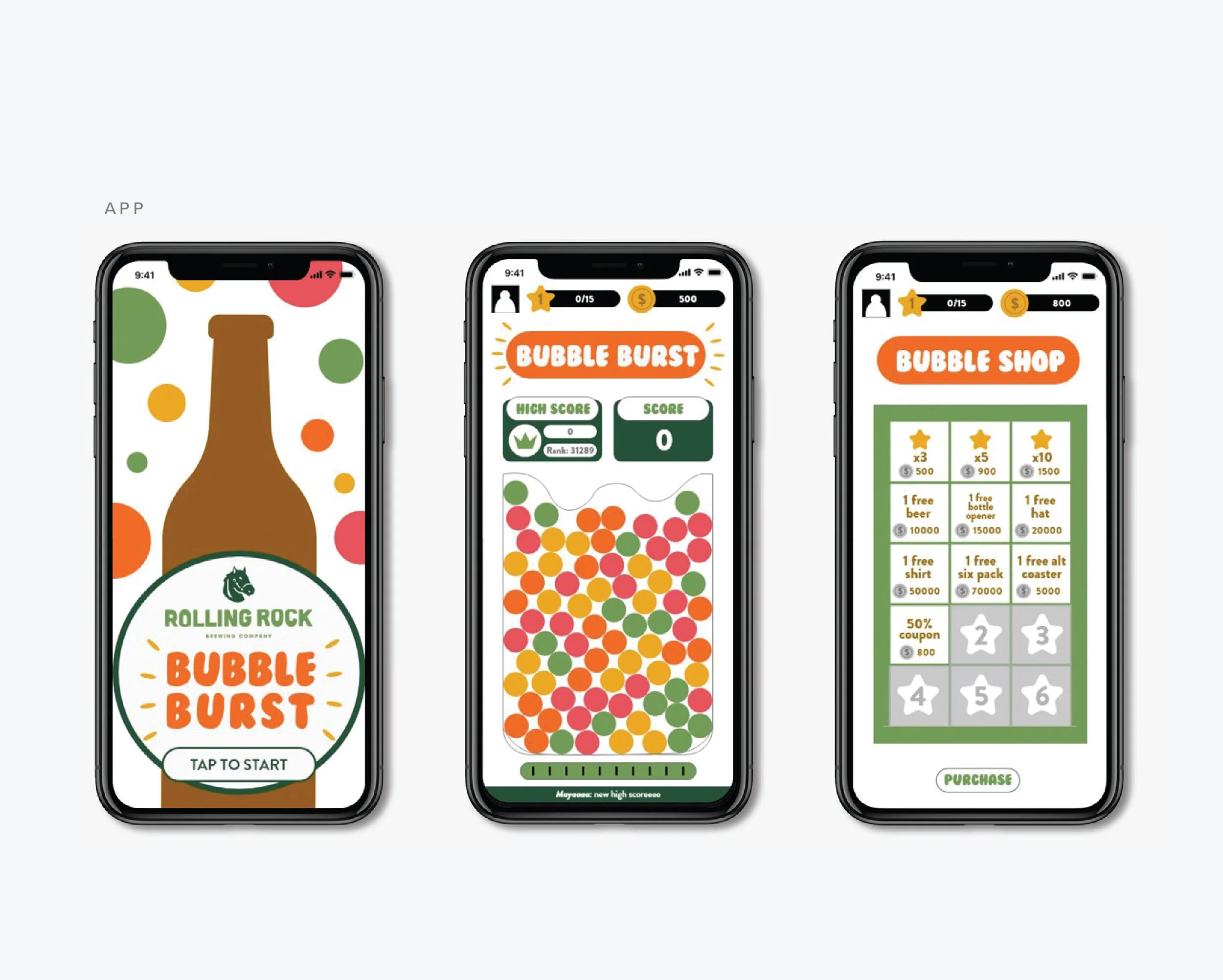
Rolling Rock has always been synonymous with honoring the blue-collar, working-class man. To extend this legacy, we developed a specialty craft beer dedicated to acknowledging and empowering hard-working women. Our new offering, Apricot Gose, was crafted to ensure women could experience the same sense of empowerment that men have long associated with Rolling Rock beer.
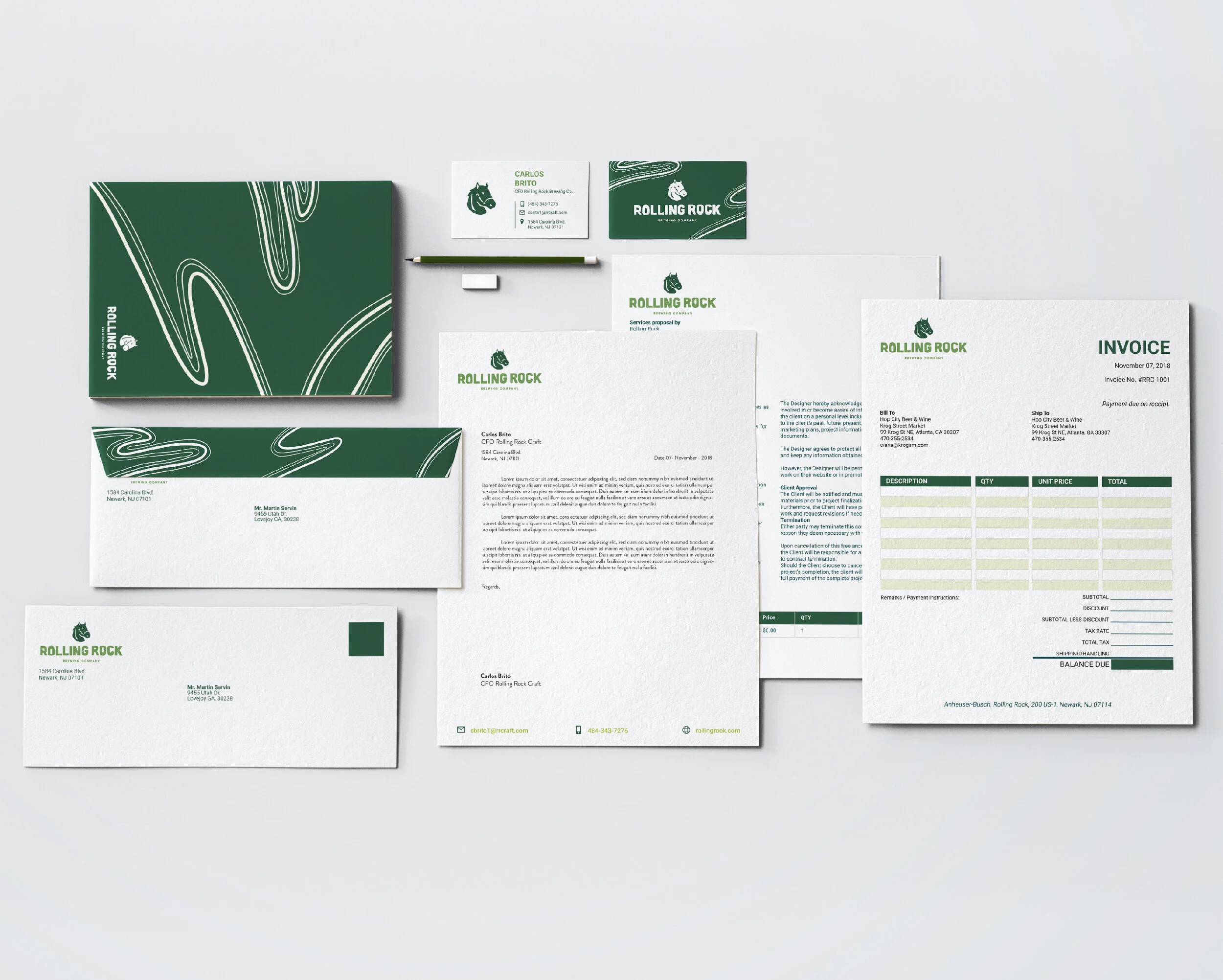
It was crucial to clarify that altering the essence of Rolling Rock was never the intention. Instead, we aimed to create a distinctive brand mark that would be instantly recognizable, yet wouldn't alienate our loyal customer base while attracting new patrons. Our overarching goal was to mirror the robust values of Rolling Rock in a comprehensive communication kit and brand awareness campaign, dispersed across a range of media platforms.
This effort entailed a meticulous approach to corporate branding, focusing on maintaining the strong heritage of Rolling Rock while introducing a fresh perspective that resonated with a broader audience. We invested significant resources in developing visual assets, messaging, and marketing collateral that not only paid homage to the established brand but also communicated our commitment to recognizing and celebrating the hard-working women in our community.
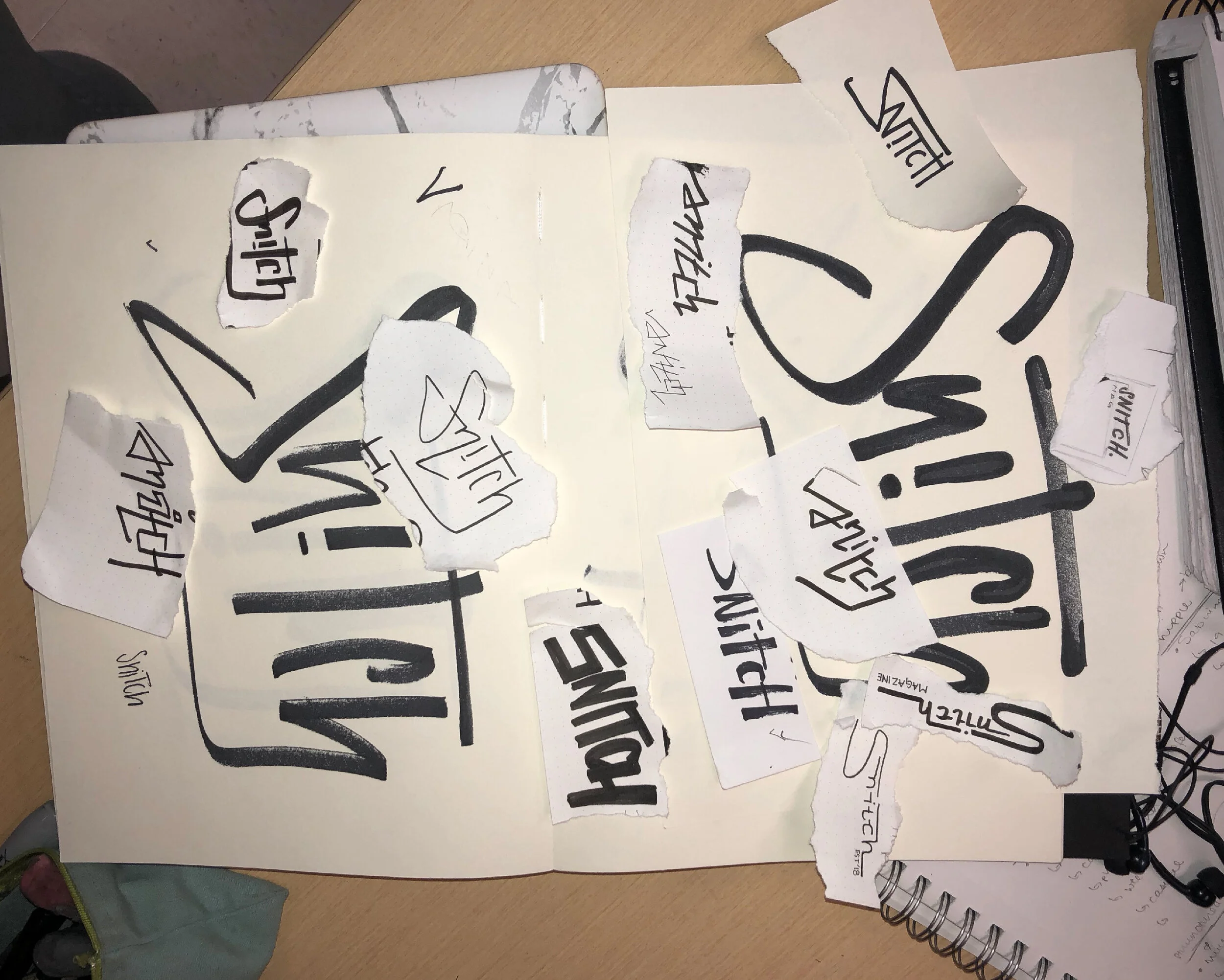
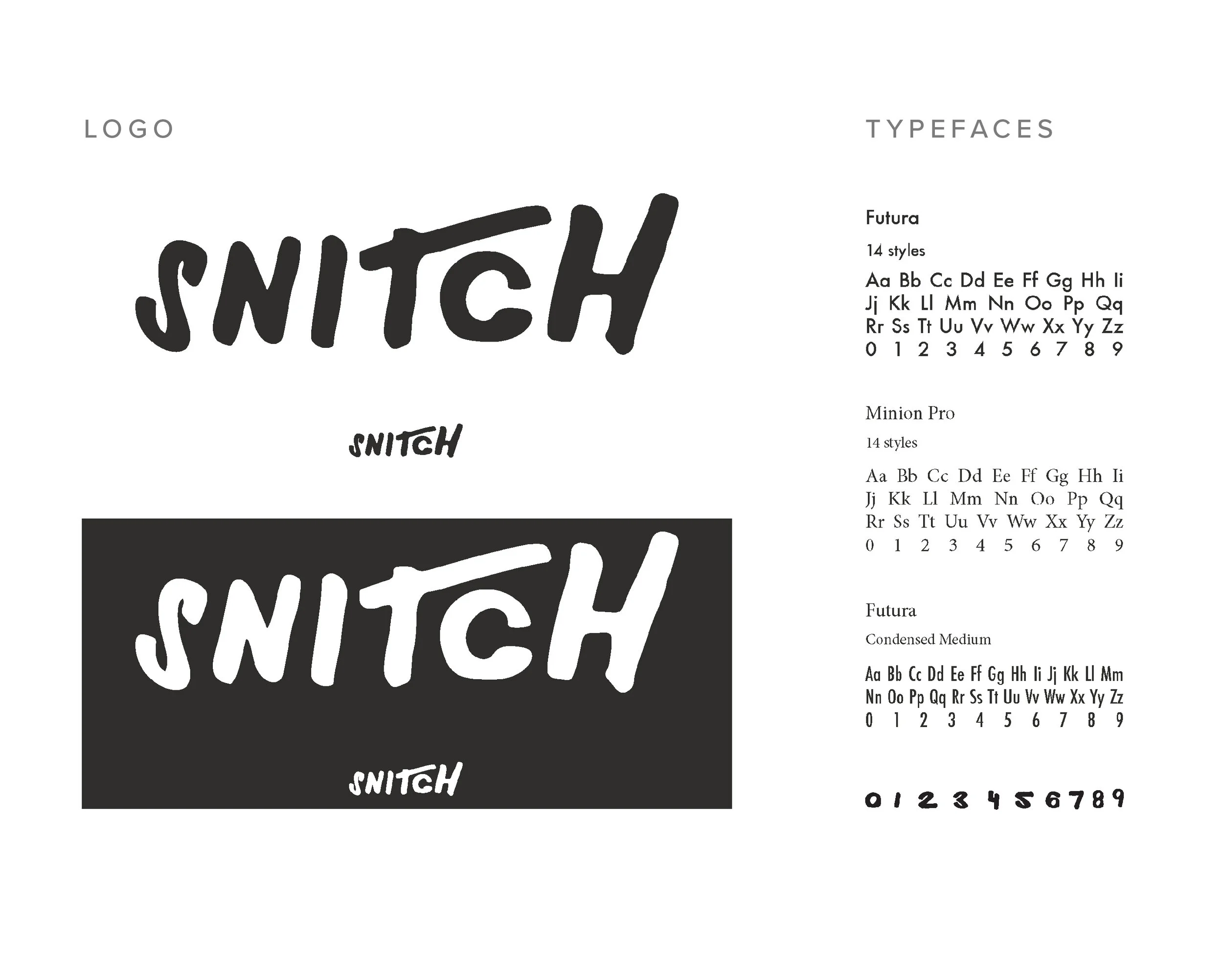
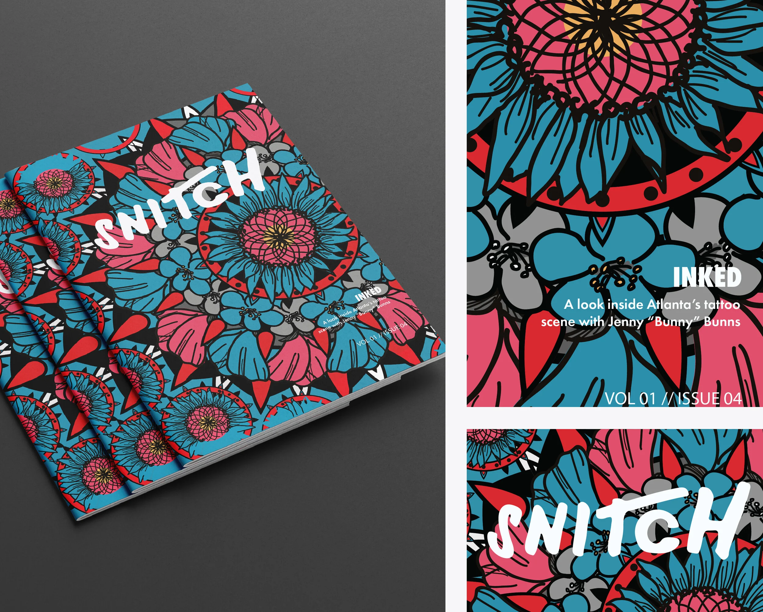
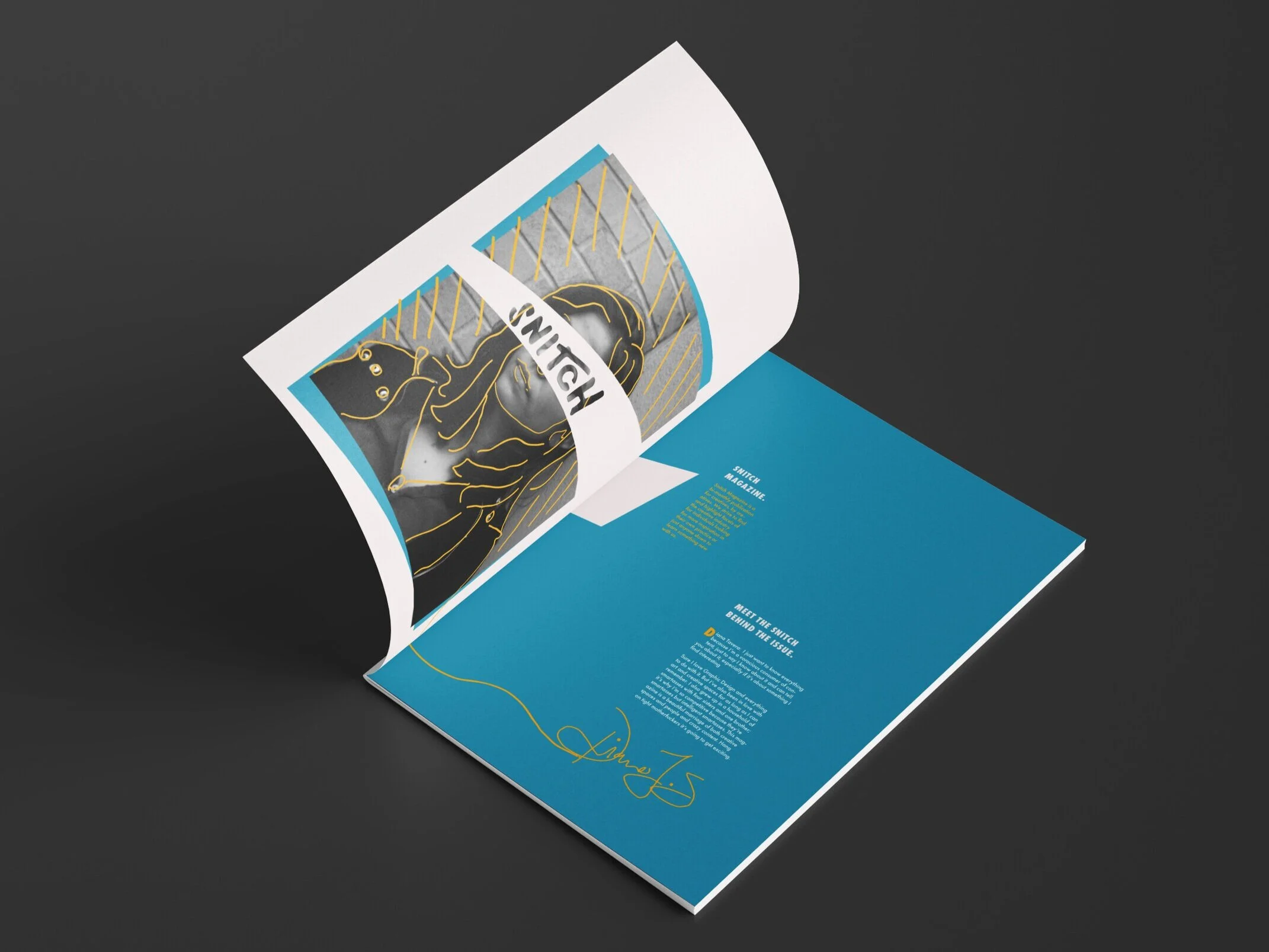
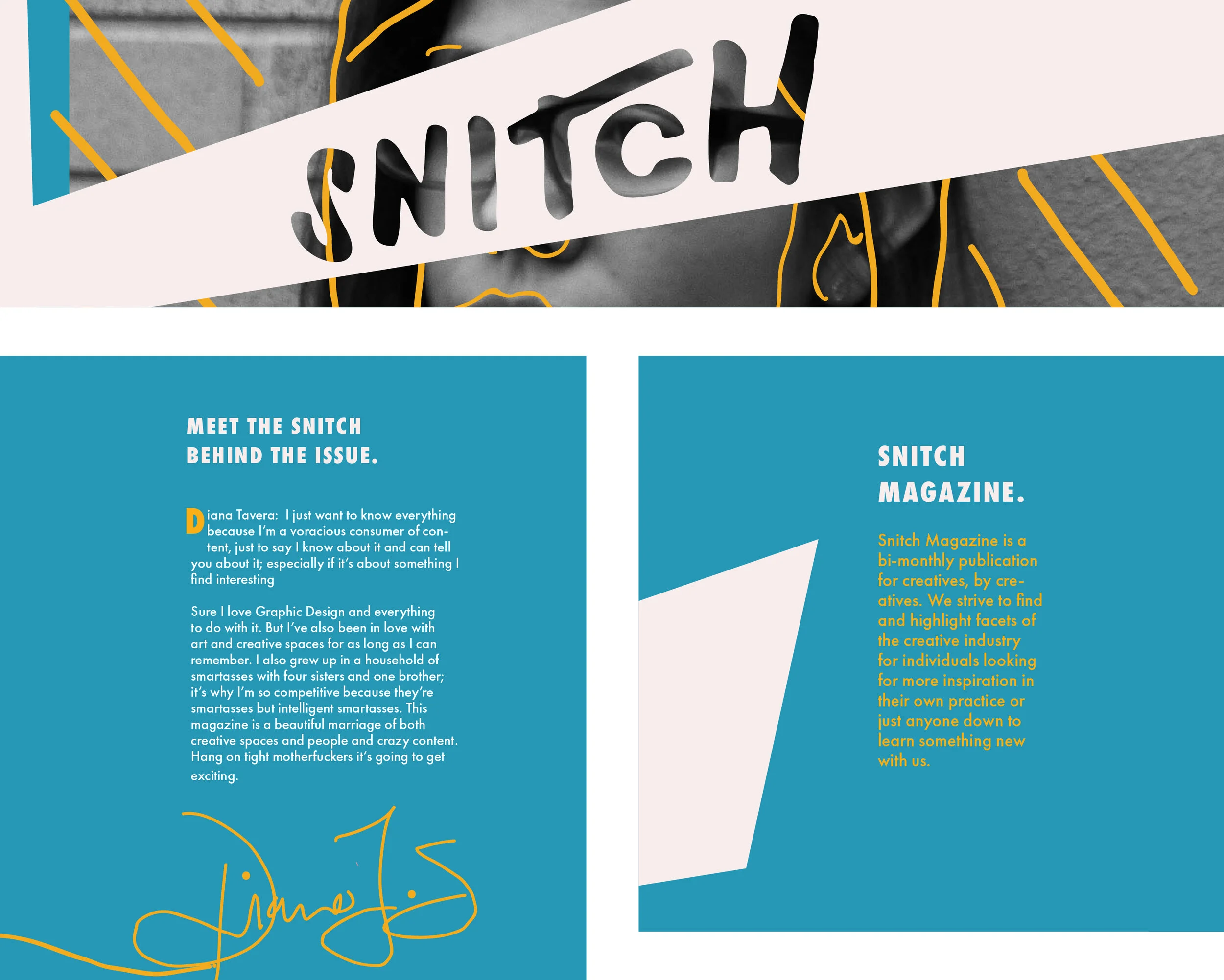
For creatives by creatives:
Volume 01, Issue 04
The aim of this magazine is to uncover and spotlight various forms of art, especially those that might not be widely known or understood. 'Snitch' becomes a hub where readers can seek inspiration or acquire new knowledge, serving as a tangible embodiment of curiosity. As readers flip through the pages, they embark on a learning journey alongside the editor who curated the issue.
Our objective was to refine the way we convey information, both verbally and visually, to create a more engaging and insightful experience. Formatting was a crucial aspect of this project, necessitating a thoughtful and deliberate approach to the layout and design. It was essential to ensure that readers could effortlessly consume and digest the content they were most interested in.
The editorial and print graphic design components played a pivotal role in the realization of this vision. Meticulous attention was paid to every detail, from selecting the most impactful images to crafting compelling narratives and designing an intuitive layout. The typography, color scheme, and visual elements were carefully chosen to create a cohesive and aesthetically pleasing aesthetic. Additionally, the layout was designed to facilitate easy navigation, enabling readers to effortlessly locate and immerse themselves in the content that resonated most with them.
Ultimately, the careful consideration given to the editorial and print graphic design aspects of this project helped create a magazine that not only informs and inspires but also provides a visually stunning and enjoyable reading experience.